How an iPhone App Beat a Crowded Niche Using Creativity
A crowded niche
Both the 'phone cleaner' and 'storage cleaner' search queries on the app store give around 550 results. Which means that if you make a new app in this category, your app (which will likely be somewhere at the bottom) won't be seen by any new users. How do you climb up?
The apps that appear on top of this search results, which are also the top grossing apps, have a high rating, many reviews and already proven to Apple's algorithm that they can convert "app page views" to revenue, so the App Store places them first in the results, and they grow even more.
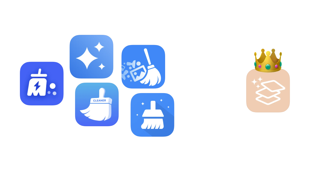
They also look VERY similar to each other:
- Use similar names with the same keywords (phone, cleaner, storage)
- Almost identical icons (a white brush+sparking on a blue background)
A few examples:
- Cleanup: Phone Storage Cleaner
- Smart Cleaner: Clean Storage
- Phone Cleaner: Clean Storage+
- Powerful Cleaner-Clean Storage
- Super Cleaner - Cleanup Master
But there's an app in the same niche, that was able to squeeze itself in between them. It looks different and uses a creative growth strategy with TikTok ads. I like how this app is able to stand out and the creativity behind its marketing.
The app uses a different icon, keywords and UI than the other apps and it stands out. But these differences don't explain the app's results in isolation. They are effective because of another major component, which is the TikTok campaign. I think it's interesting to simultaneously look at how this app is different, and the campaign, to try to understand the app's marketing, which proved to be very effective.
The campaign
A few examples of the video ads on TikTok that the app uses:
41M views - by an account with 114K followers
24.2M views - by an account with 49K followers
36.6M views - by an account with 55K followers
8.9M views - by an account with 88K followers
2.6M views - by an account with 790K followers
5.6M views (Portuguese) - by an account with 900K followers
1.4M views (Portuguese) - by an account with 765K followers
There are a few things in common for these ads:
- They mostly target a younger female audience.
- The are all made by creators with the range of 50-100K (with a few exceptions), and posted to their personal feeds.
- There's no rigid script, and I assume the creators decide how the video should be.
- These videos are heavily promoted, besides being posted to the creator accounts - and have many more views than the average video of these creators. For example, the first example above, got over 40M views, but the creator gets below 5K views on average for her organic videos.
- All the videos feature the UI of the app in use. The UI is very colorful, has large buttons and is easy to use - it's perfect for a quick TikTok demonstration.
- Some of the videos emphasize how fun and easy it is to use the app - and focus first on going through the pictures, and the photos cleanup part is secondary. For example, the script for the first video, which demos the app in use:
- what a fun way to go through the pictures
- swipe right to keep
- swipe left to delete
- videos automatically play
- super easy to delete in bulk
- saves so much time and storage on your phone
The App itself
The metadata of the app makes more sense when examined together with the campaign above, which helps explain why this app decided to go with different metadata than the other apps which are already proven.
-
The icon - you can immediately notice how the color is different from the blue color that ALL the other apps use. If you google "apricot color" in google images, you'll get mostly results of makeup and other products that target a female audience
-
The screenshots - The app's screenshots on the app store page, promote "easy and fun" cleaning, using swiping. Unlike all the other apps that focus on the benefits of cleaning up storage, this app focuses on ease of use and the process.
-
The keywords - The title of an app is the most important place to put the keywords you want to compete for. All the other apps in the niche all stuff the title with the most critical keywords, which there is also a lot of competition for. This app's title 'Photo Cleaner: Swipewipe' stands out in the fact that it isn't so concerned with the keywords, and tries to have an original app name instead. But, the app's name 'swipewipe' is still placed last in the title, to emphasize 'photo' and 'cleaner' for the algorithm.
-
The UI - The UI has large buttons, in all caps and is very easy and simple to use, very focused on the fun photo viewing experience. If I would imagine a UI that is perfect for TikTok demonstrations, even at the cost of usability, it would be it. (A little like the fake food outside of a Japanese restaurant).
Takeaway
This is another example for how authentic short video ads are proving to be an effective growth strategy for mobile apps. I though it's especially interesting how this app extended the tiktok campaign into the app itself by optimizing the metadata and even the ui to improve the campaign results. What do you think about this campaign? Let me know by replying to this tweet.
If you enjoyed this analysis and would like to get notified about my next one, make sure to subscribe to my newsletter and follow me on 𝕏.